Erika Kreilach
Graphic Designer


This project was part of an initiative to create educational posters for Oklahoma’s Driver Testing Online program, with a focus on the Wichita Mountains region. This design project required incorporating the provided body copy while visually tying the graphics to the region—most notably through the use of buffalo imagery. The goal was to create a cohesive and engaging visual identity that honored the local culture and environment, while ensuring the copy remained central to the layout.
I designed three posters, each with a unique layout strategy aimed at drawing attention to key information through the use of contrast, scale, and thoughtful placement. Across all three, I established clear visual hierarchy to guide the viewer’s eye and ensure the body copy remained easy to read.
…
Poster 1: Showcasing a bold buffalo silhouette filled with a scenic image, creating an eye-catching focal point tied directly to the region. I kept the surrounding space minimal and clean to prevent visual clutter and help the permit test text stand out. The use of dark blue and white provided high contrast, further supporting readability.
…
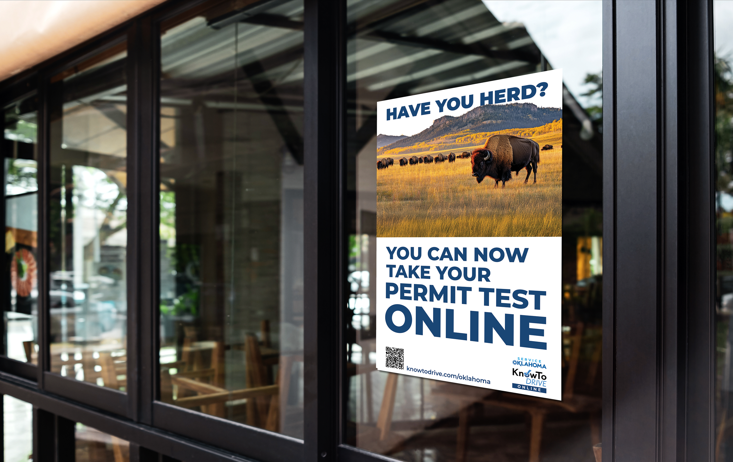
Poster 2: Strategically uses white negative space at the bottom to anchor the body copy and pull focus. That same approach is applied to the top text, which is placed behind the mountain imagery to add a sense of depth without sacrificing clarity.
…
Poster 3: Featuring one large scenic image as the background, with bold, high-contrast text in a larger scale to immediately draw the viewer’s attention to key information. Like Poster 2, the top text is partially tucked behind the mountain to add dimension while keeping the overall message clear and visually grounded.
This project showcases my ability to integrate regional identity with clear communication goals, using design fundamentals to create posters that are both visually engaging and functionally effective.